Background:
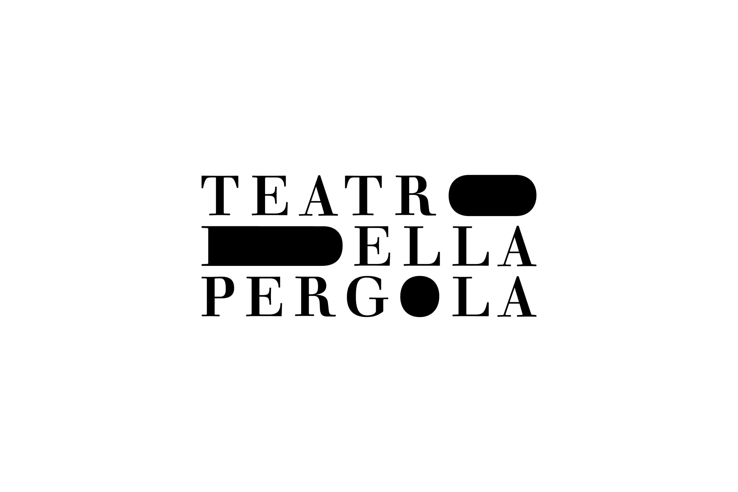
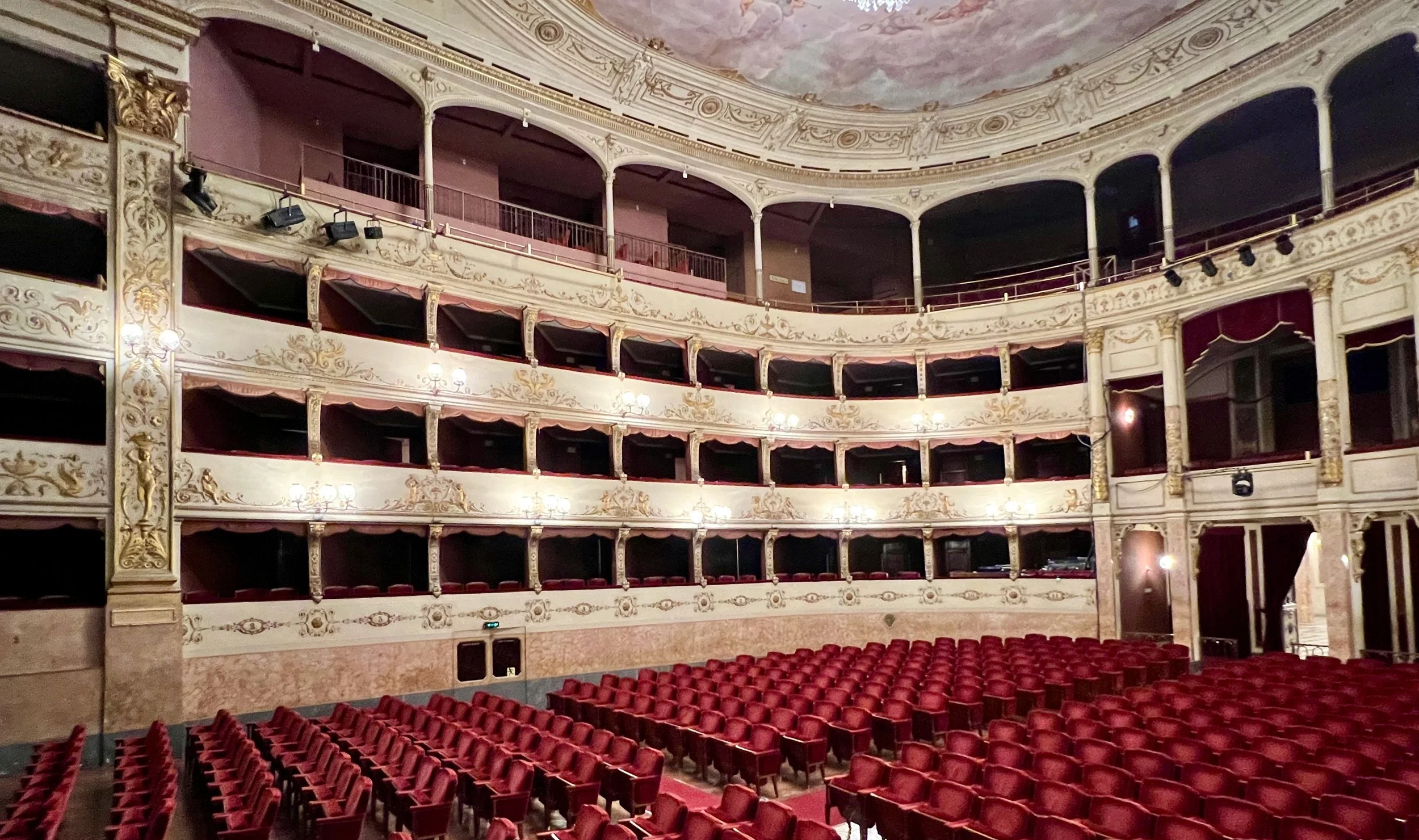
Located in Florence, the Teatro della Pergola is one of Italy’s oldest opera houses, embodying the city's rich cultural heritage. Built in 1656, the theater is notable for its distinctive design, featuring stacked box seating instead of the traditional semi-circular arrangement.
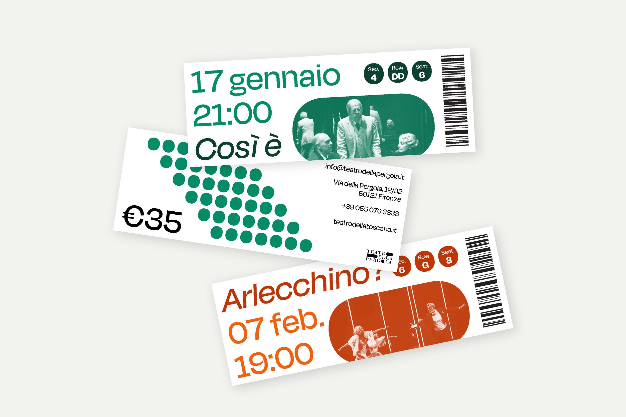
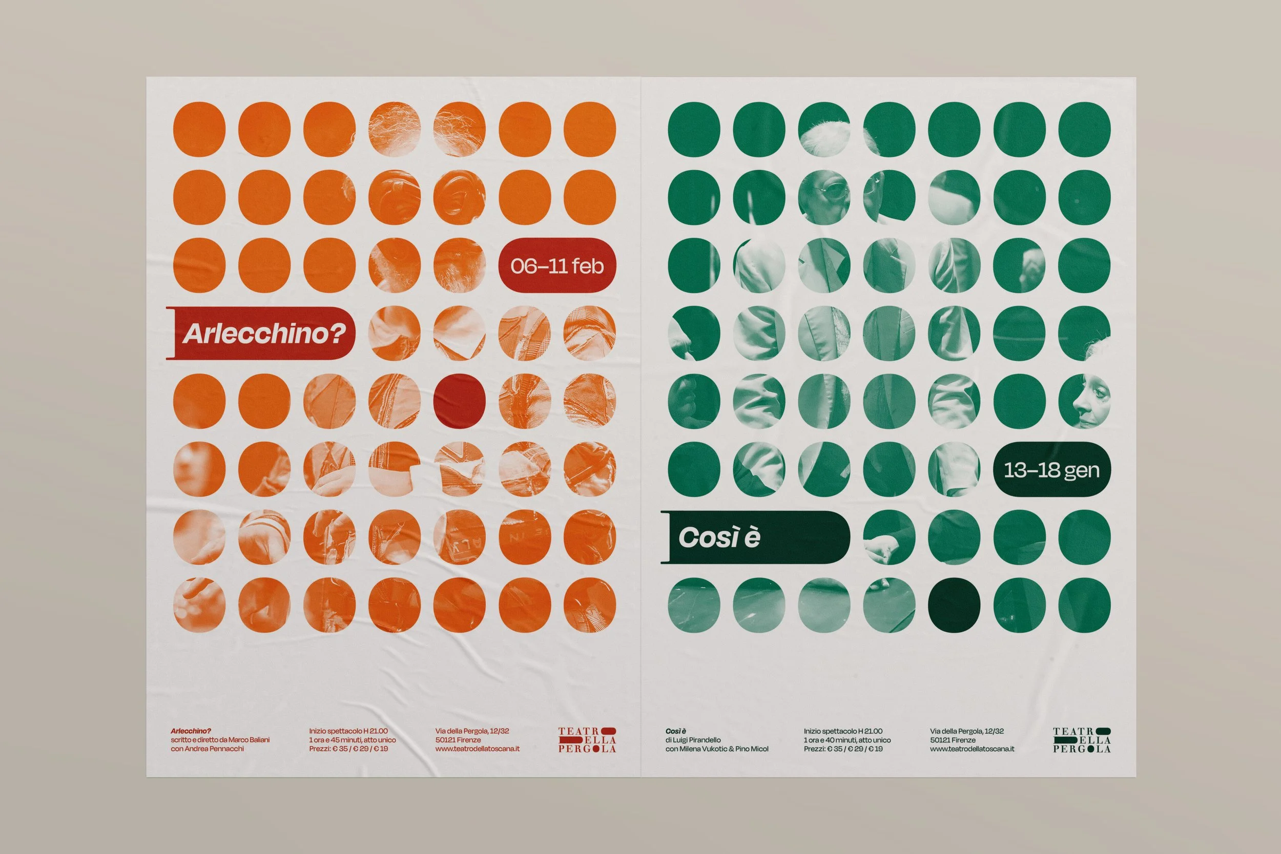
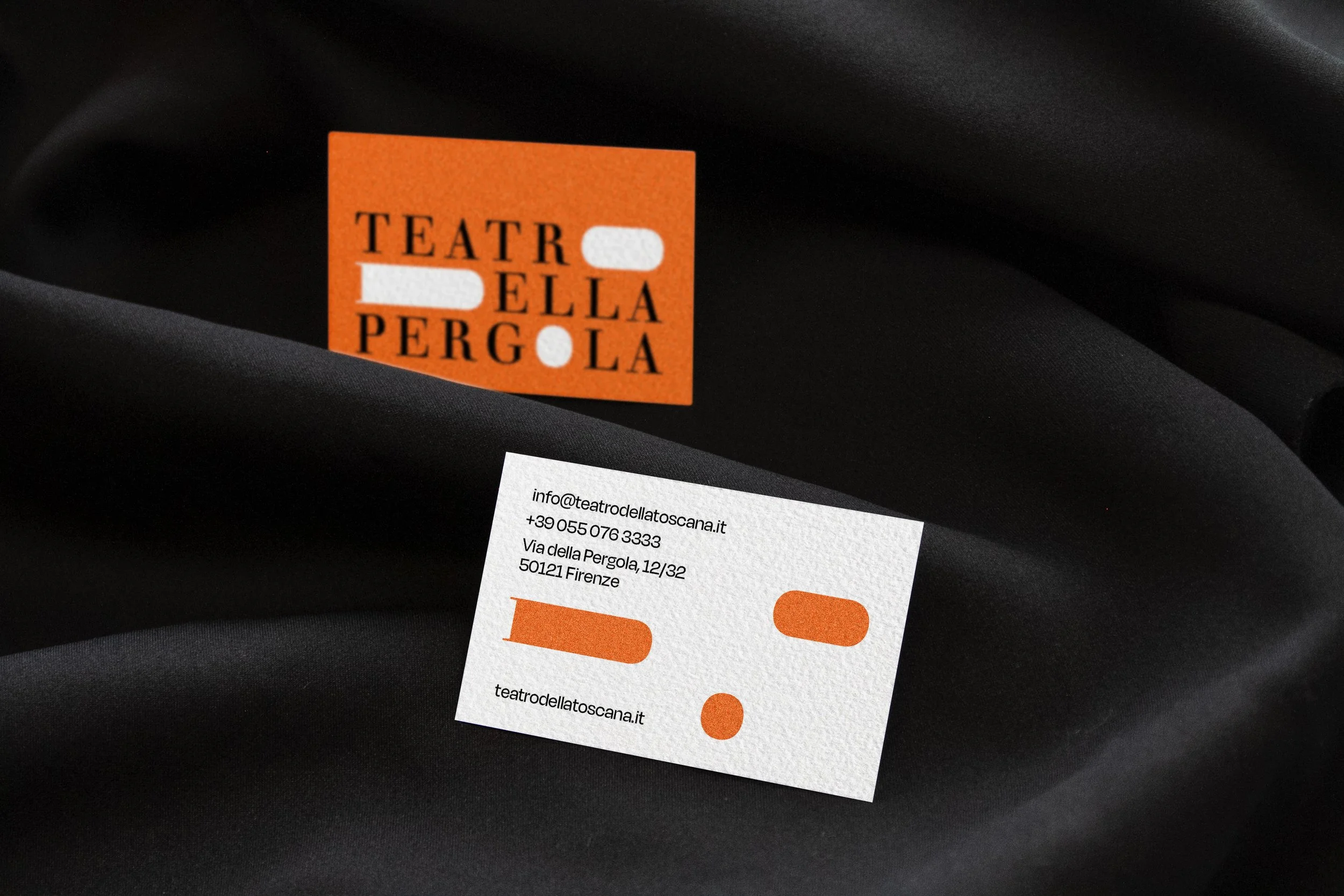
The logo highlights this innovative structure, focusing on the three-tiered private seating, symbolizing the intimate and exclusive experience offered by the venue's unique architectural layout.
Overseen by Silvia Agozzino

Strategy:
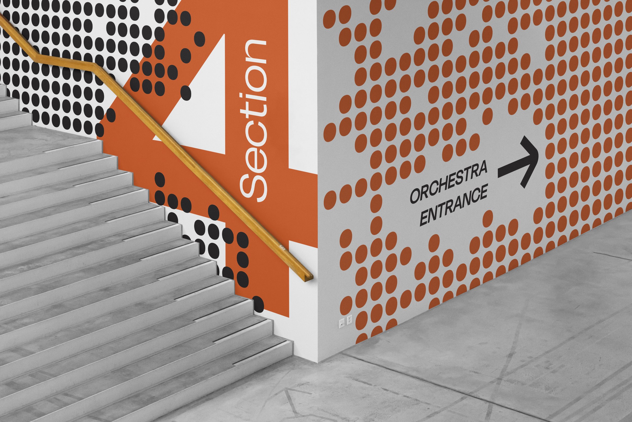
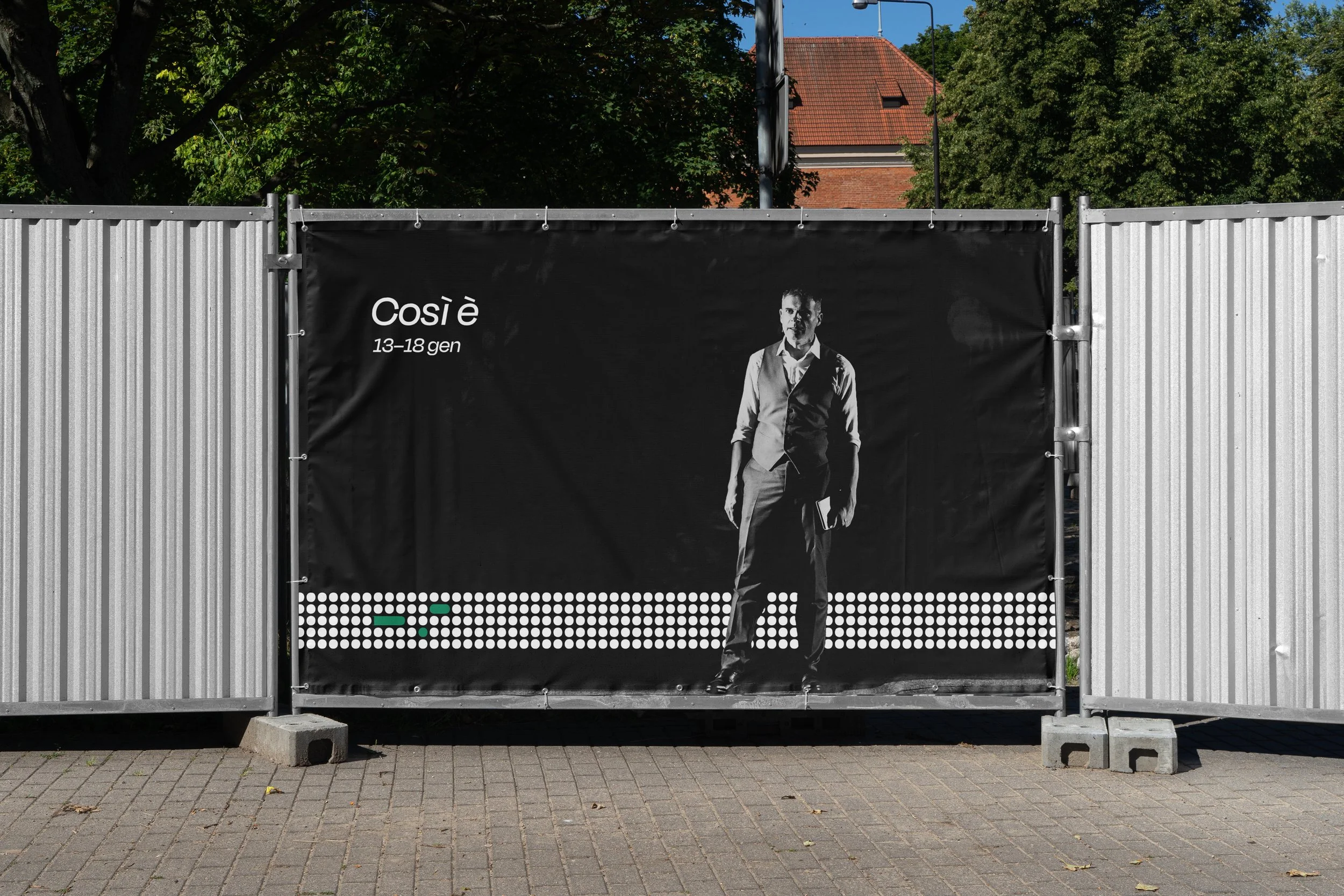
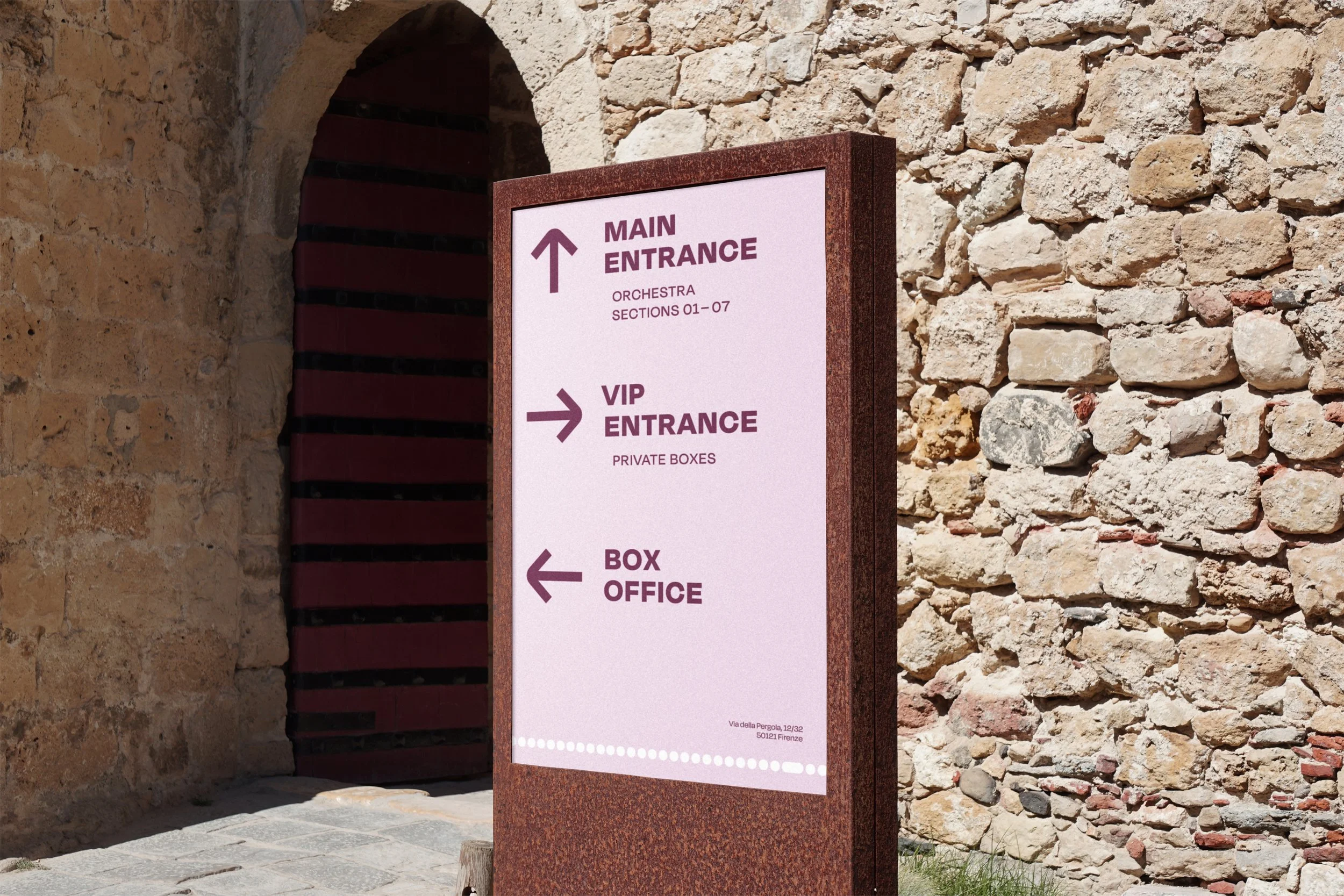
The logo’s construction on a robust grid system allows for effortless text removal and substitution with circular elements to create a cohesive and adaptable pattern. This flexibility accommodates the integration of performance imagery within the container of the graphics, echoing the individual perspective of each theater box. Extending across advertisements, merchandise, and print materials, the pattern helps maintain the theater’s unified brand identity.
The typography selection aims to embrace a new generation of theatergoers and a more diverse audience while still honoring the theater’s rich 350-year history.