The Brief:
Throughout the past decade, the local and global art scene had evolved significantly while the Allen Art Institute’s visual expression had not. The task was to create a new logo for the organization and a modern brand identity that would represent them better. The goal was to raise awareness for a wider audience, proving its value in a crowded landscape of art museums, institutes, and galleries. This case study was created for a hypothetical client.
Primary Logo Strategy:
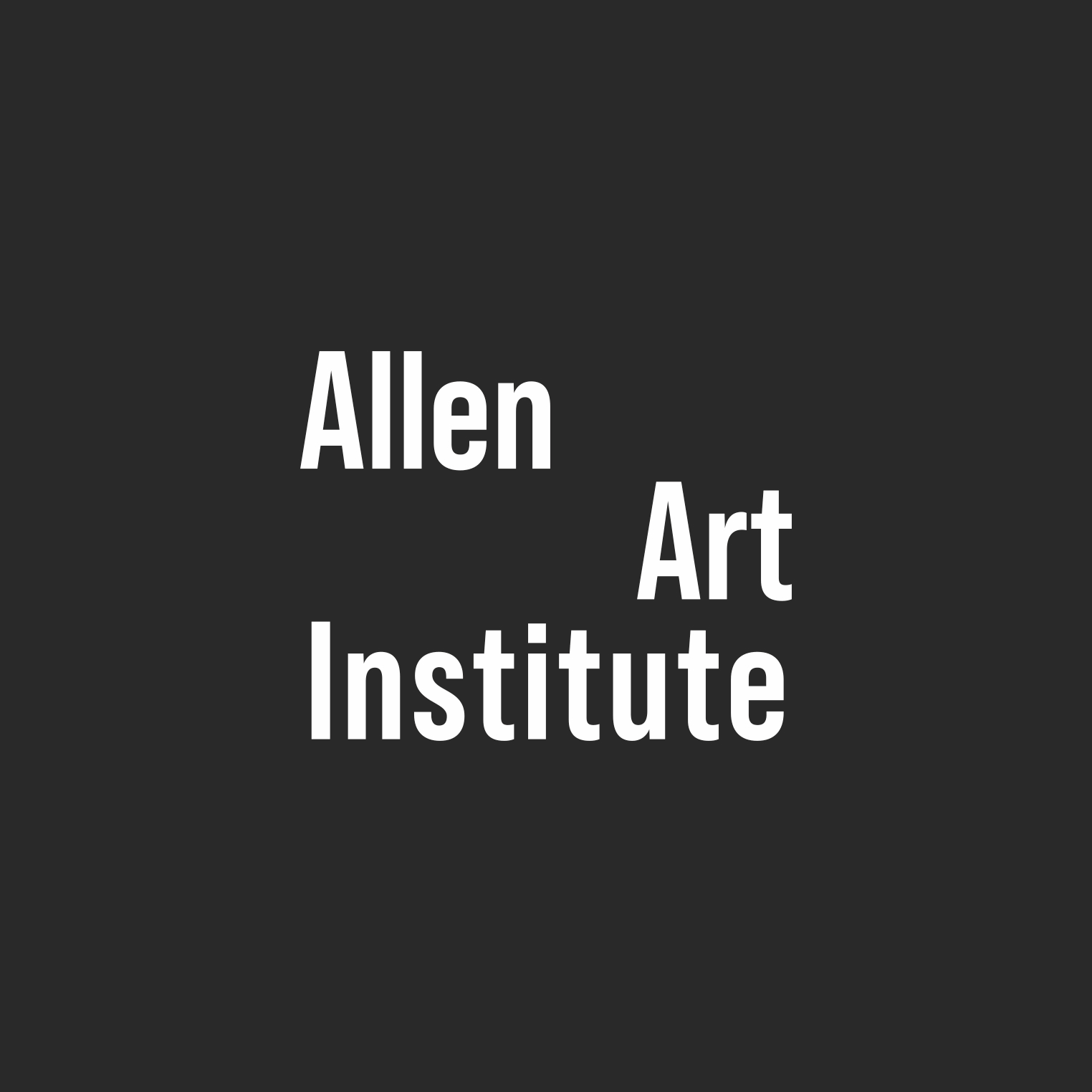
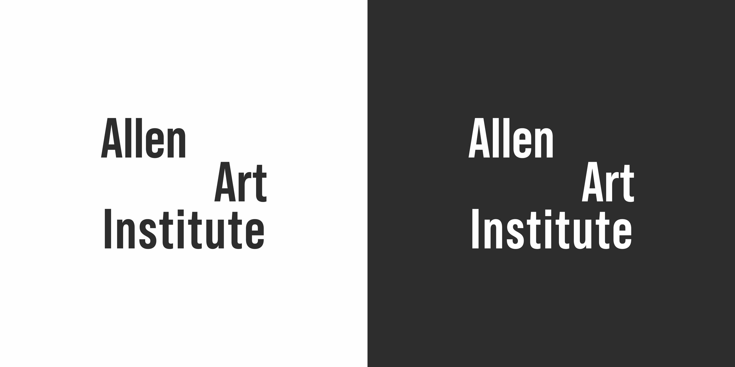
The logo was designed with a nod to the similar square designs that other art organizations utilize. While doing research for this project it became clear that countless art institutions have their logo in a square shape with the text aligned to one side (SAM, AIC, SAIC, SDMA and SMFA at Tufts). The ‘Allen’ is breaking alignment from the rest of the text and aligned left to signify the Institute separating itself from other organizations with its unconventional and ambitious approach. The decision to choose a thicker font was also to differentiate from the countless art organizations that use fonts with thinner weights.


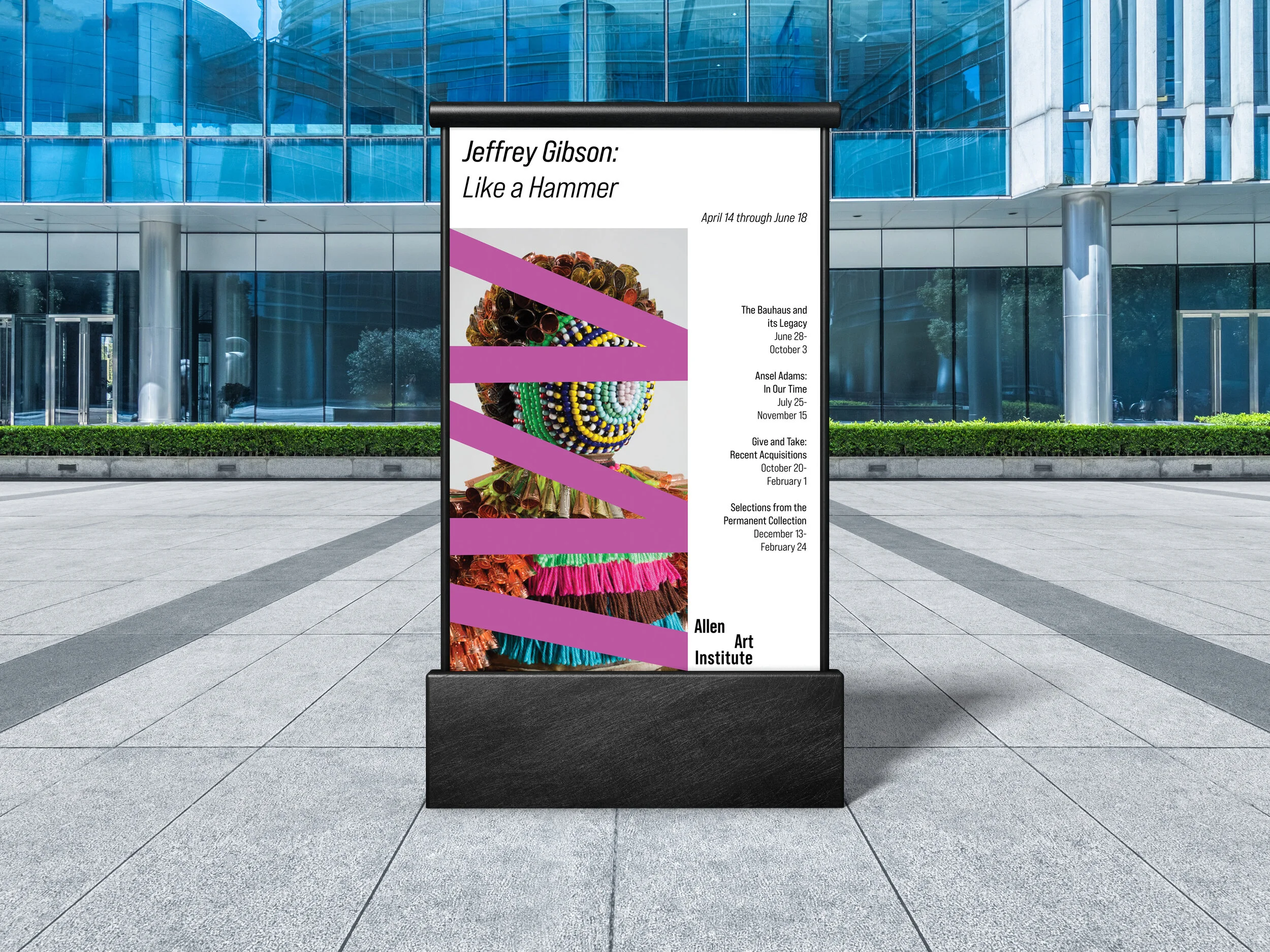
A bold secondary mark was developed to unify the visual identity without always relying on the primary logo.
It features the organization's initials (AAI) rotated 90 degrees, with the crossbar of each "A" removed for a dynamic look.


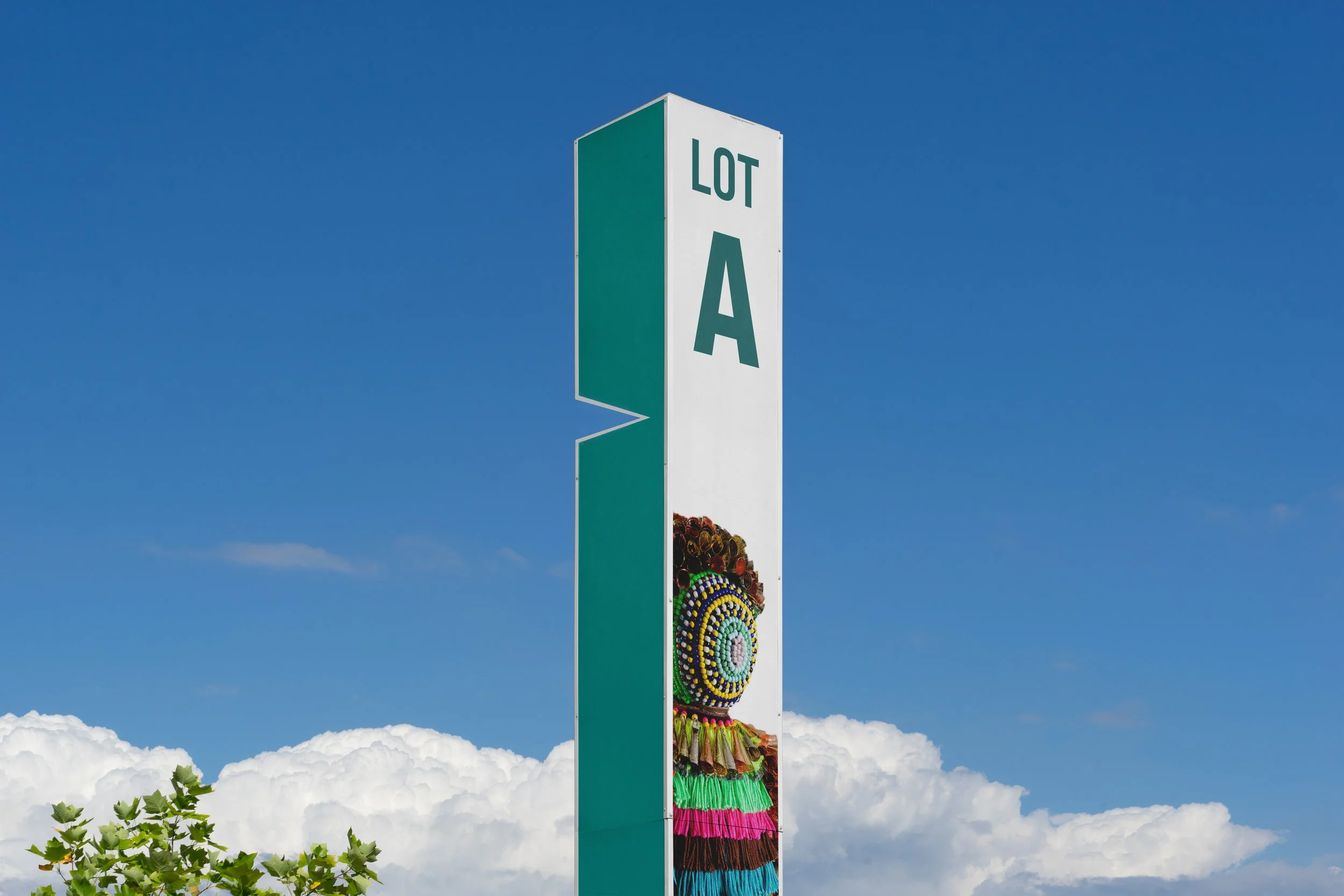

The secondary mark is consistently placed over images in posters, with one large image representing the exhibition. This system uses the mark to dramatically crop and contrast the image, creating a modern and ambitious identity.